Bücher versandkostenfrei*100 Tage RückgaberechtAbholung in der Wunschfiliale

Sofort lieferbar (Download)
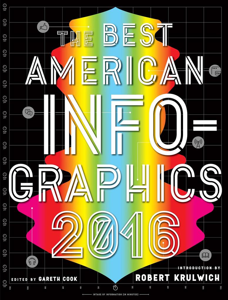
'; When it comes to infographicsthe best work in this field grabs those eyes, keeps them glued, and the grip is sensualand often immediate. A good graphic says '; See what I see!' and either you do or you don't. The best onespull you right in, and won't let you go.' From the introduction by Robert Krulwich The year's most '; awesome' (RedOrbit) infographics reveal aspects of our world in often startling waysfrom a haunting graphic mapping the journey of 15, 790 slave ships over 315 years, to a yearlong data drawing project on postcards that records and cements a trans-Atlantic friendship. The Best American Infographics 2016 covers the realms of social issues, health, sports, arts and culture, and politicsincluding crisp visual data on the likely Democratic/Republican leanings ofan array of professions (proving that your urologist is far more likely to be a Republican than your pediatrician). Here once again are the most innovative print and electronic infographics'; the full spectrum of the genrefrom authoritative to playful' (Scientific American). ROBERT KRULWICH is the cohost of Radiolab and a science correspondent for NPR. He writes, draws, and cartoons at Curiously Krulwich, where he synthesizes scientific concepts into colorful, one-of-a-kind blog posts. He has won several Emmy awards for his work on television, and has been called '; the most inventive network reporter in television' by TV Guide.
Mehr aus dieser Reihe
Produktdetails
Erscheinungsdatum
04. Oktober 2016
Sprache
englisch
Seitenanzahl
160
Dateigröße
320,48 MB
Reihe
The Best American Series (R)
Herausgegeben von
Gareth Cook
Verlag/Hersteller
Kopierschutz
mit Adobe-DRM-Kopierschutz
Family Sharing
Ja
Produktart
EBOOK
Dateiformat
EPUB
ISBN
9780544867086
Entdecken Sie mehr
Bewertungen
0 Bewertungen
Es wurden noch keine Bewertungen abgegeben. Schreiben Sie die erste Bewertung zu "Best American Infographics 2016" und helfen Sie damit anderen bei der Kaufentscheidung.


